Color. It seems like an easy enough principle. We start learning about color soon after we learn to speak. We draw rainbows as soon as we are given that first set of crayons. And I distinctly remember coloring a Care Bear worksheet my very first day of Mrs. Cox’s kindergarden class.
Color is all around us and infused into our memories. In it’s most basic concept, color is easy and comfortable.
But once we grow up, color isn’t so easy. We avoid clothing because of bright colors and patterns. We make decisions in our furniture pieces that are safe and will “always coordinate with everything.” We live our lives in neutral spaces – and throw in splashes of color when we are feeling bold. As adults, color isn’t quite as comfortable as it once was.
So, when I talk on this blog about my obsession with color, I know it scares a lot of you. I often hear, “Oh, I love that, but I could never do that in my house” or “I don’t even know where to start adding color.” It’s definitely an understandable response to the color overload it seems that I have going on here.
Although it my seem willy-nilly, my color selection is quite intensional. A lot of thought goes into the color palette for each room, which in turn makes color feel easy and natural. Today, I’m going to let you in on my secret formula, which works for paint, fabric or furniture selection.
1. Capture the Mood – The only thing more important than knowing how you are going to use your space (i.e. kitchen, office, bedroom, etc), is figuring out the mood you want the room to convey. From the moment someone walks into your space, the mood of the room triggers an emotional response in them.
Room moods can vary from relaxing or energizing, to cozy or playful. And it’s okay for each room in your home to have a slightly different mood. For example, I wanted my office to be inspiring, my bedroom to be boutique and my powder room to be exciting and welcoming.

2. Consider Your History – Once you figure out the mood of the room, consider if it will be a good playmate with the rest of your home. Even though each room does not have to be decorated in the same mood, it does have to flow well from place to place. It might feel uncomfortable to walk from a room that’s soft and serene into one that’s incredibly energizing. Such rooms can exist within the same home, but it’s probably best to not have them in adjacent areas.
3. Set the Tone – Now is the time to set the tone and finally start thinking about color. Within your room’s mood and your home’s history, think about the color tones that will work for you. This is where you think about cool colors (blues, greens, purples) or warm colors (reds, oranges, yellows). You think about pastels versus jewel tones. You decide if you want to bring in opposite color tones or bring in different shades of the same color.
The color tone will be a guide to help narrow down your color choices.
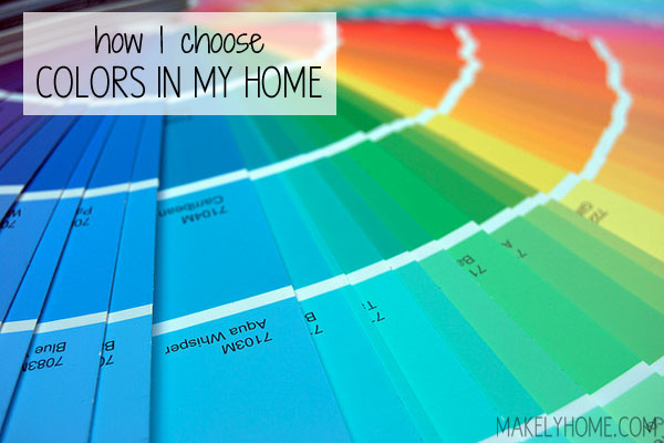
4. Stack the Deck – Did you know that the paint chips on a wall in a home improvement or paint store only represent a fraction of the colors that each paint company offers? Yep, it’s true! Those chips are generally the company’s most popular colors, but there are hundreds of other shades that should be considered. Now, I know that sounds like a daunting proposition, but it’s really not when you know how a paint fan deck is laid out.
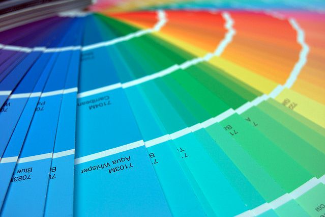
Although each paint company is different, a paint fan deck usually contains long strips of a color in various tones. The one at the top will be the tone of that color that reflects light the most (i.e. the lightest) and the bottom color is the one that reflects color the least (i.e. the darkest).
When choosing colors for my home (which contains a lot of bold colors), I generally choose tones in the middle to near bottom of the strip. If your mood calls for lighter tones, stay in the top one or two colors on each strip. This method will keep you on track when you have hundreds of colors laid out in front of you.
You can buy paint decks online for most paint companies. Just google “Paint Company X fan deck” for whatever company you are looking for, and a link will come up somewhere. They vary in price – usually about $30 – but I have found them to be well worth the price. You can also borrow them at the store, but you will not be able to take them borrowed fan decks home. I like to look at colors in the room that I am working on.
5. Take the Wheel – As cerebral as it seems, the color wheel is always a good place to visit when you are selecting color. I always start with a primary color -usually blue, but sometimes yellow or a blue red.

Once you pick your primary color, take a look at the fan deck and choose a few shades of that color you love. Then pick a few in the same area (top, bottom or middle) of the fan deck strip of adjacent and complementary colors on the color wheel. Remembering that white, black and gray are universal, figure out a few different combinations of colors that draw you in.
6. Try It Out – Once you have a few combinations that you like, try them out together. Put the swatches together and see how they look. Grab some colored pencils and color some swatches on a sheet of paper. Look for fabrics that feature those colors. Buy some sample jars of paint from and test them out on your walls.
Looking back over this post, color may still seem really daunting. The first few times you start exploring color, it may take you some time to go through these six steps and give them full consideration. And you may hate me for making you have to really think about it so much. 😉
But as time goes on, it becomes second nature. I do all of these things now without even thinking twice about it. I have found my moods, learned the fan deck and memorized the color wheel. You will eventually do these things, too. And then, color will become as easy and comfortable as it was to you when you were a child.
Do you have trouble selecting colors for your home?
[…] here to read the full […]