Makely

Let's Make Life Awesome

  • Home
  • Decorating/DIY
    • Create Your Decor
    • Decorate Your Home
    • Paint Your Walls
    • Transform Your Furniture
  • Healthy Living
    • Essential Oils
    • Family Wellness
    • Household Care
  • Project Gallery
  • Contact

Show Your Colors with My Colortopia

by Lindsay Ballard on September 24, 2012 1,287 Comments

This post is sponsored by Glidden.

One of the most inspiring things about running a blog is that you have an online record of your room or project Befores and Afters.  On days (and even weeks) that I’m feeling like nothing is getting accomplished, I like to look at the thumbnails in my Project Gallery.  Those little squares make me feel so happy, and I feel like they are proof that I have really gotten a lot done over the years.

Similarly, I think most of you guys like Before and After posts, too.  There’s something encouraging about seeing a dramatic change in an entire room or just a piece of furniture.
For the past couple of months, those of us in the My Colortopia Team have been focusing on Before and After posts on Glidden’s My Colortopia blog.  But now, it’s not just bloggers who can get in on the action.  My Colortopia has recently launched a Show Your Colors section that features photos submitted by readers.  These Before and After photos celebrate readers’ paint projects and serve as inspiration for others.  If you see someone’s project that you really like, you can even find the Glidden paint colors to match any photo in the gallery.

There are some really great projects over there! Did you see my friend Michelle’s striped foyer in the widget above? She and I have a little surprise for you coming up soon!

I know you’ve seen my projects, but I want to be able to hop on to MyColortopia and see YOUR projects, too!  You don’t need to be a blogger to participate.  All you need to do is visit the Show Your Colors section of My Colortopia and submit your photos.  After you upload them, you can write a little blurb about your room if you want to.

To get you started, here are a few of my transformations:

  • A New Life for an Old Piece of Furniture
  • A Vibrant Room for a Vibrant Boy
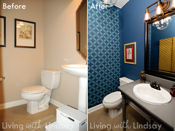
  • A Dramatically Different Powder Room

If you upload some photos to My Colortopia, let me know below in the comments so I can go and check them out!

I have been sponsored by Glidden® brand paint to write this post but the thoughts and opinions expressed are my own.
How to Keep Bold Colors and Graphic Wall Patterns from Overpowering a Room

by Lindsay Ballard on September 17, 2012 1,872 Comments

There’s no surprise that I’m a huge fan of bold colors and graphic wall patterns.  I love the impact that both elements bring to a room, and I combine the two whenever possible.  However, the magic in a bold, graphic room is knowing where to play up the boldness and where to tone it down.

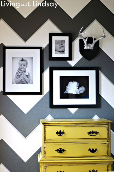
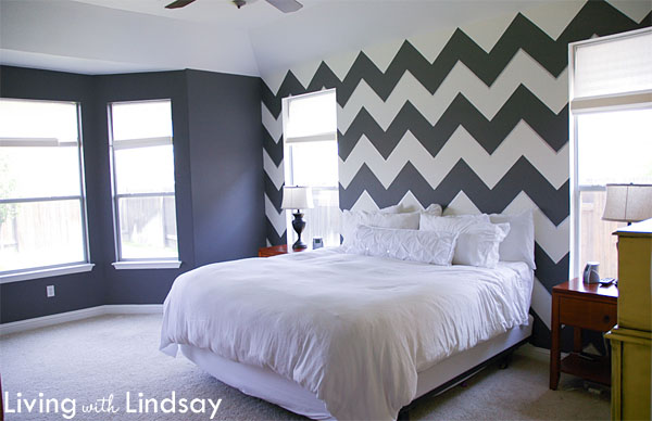
Last year when I first painted the grey and white chevrons in my bedroom, I admit that it felt like too much.  It was really the only thing I had done in the room.  I knew that there was much more coming, but I can see why friends and neighbors (and even some of you guys) couldn’t see through to my final vision.  The graphic pattern hadn’t been toned down yet.

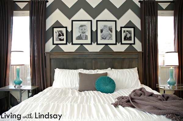
As I went through the process of accessorizing, the room gradually came into focus.  Softening the hard lines of the pattern with fabric curtain panels certainly helped.  A tall headboard and family photo gallery changed the look of the wall above the bed from the look in the previous photo to the look it has today.

Letting the boldness of a room take a backseat isn’t a specialized talent.  Instead, it’s just one of those learned skills that I’m positive anyone could pull off.  The key is to treat graphic wall patterns and bold wall colors just like they are a regular, single colored wall.  Accessorize them in the same way you would any other wall.  Hang curtains to soften the lines.  Use different textures throughout the room, so you don’t have an entire room of hard, sharp feeling surfaces.

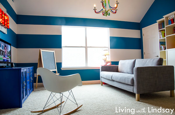
Look at the impact that just hanging a curtain makes on a striped wall.  Here is my ongoing playroom project (I’m so close to being finished!) before I hung the curtain rod.

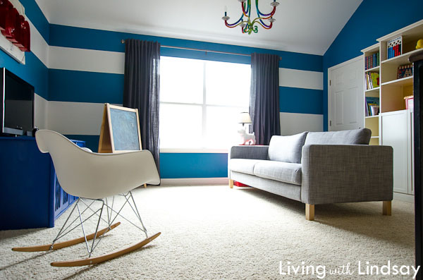
And here it is now, with the only difference being the curtain rod hung and a set of Ikea Ritva curtains flanking the window.

Just that little bit of neutral fabric does a lot to make the stripes in the room take on a less harsh vibe.  It hides the end points of the stripes as they hit the window, so the room doesn’t look quite so broken up.  In my opinion, this has the same effect as wearing a nude colored shoe, but instead of making your legs look longer, it makes the wall look wider.

I will eventually hang something on the walls on either side of the window in the playroom, too.  That will further help the stripes to take a backseat to the rest of the room, like they did on this wall in my bedroom.

Bold colors and graphic patterns don’t have to completely overwhelm a room.  Try to work them into a space so that they don’t become the room.  It may feel scary before you get to the accessorizing point, but it does eventually all come together.

What’s your take on bold walls?  Have you given much thought to accessorizing them so that set the mood without being the only thing you see in a room?

« Previous Page
Next Page »
  • Email
  • Facebook
  • Instagram
  • Pinterest
  • Twitter

About Makely

Lindsay Ballard is a former college mascot turned political geek turned roller derby playing, DIY fanatic.

Lindsay chronicles her projects, design ideas, and lifestyle tips here at Makely, where she shares tutorials and inspiration. Her DIY designs are bold and graphic, while her spirit is fun and full of color.


Archives

Categories

PRIVACY POLICY
Copyright © 2009-2019 Makely School for Girls | All Rights Reserved | Posts may contain advertising content or affiliate links