Color. It seems like an easy enough principle. We start learning about color soon after we learn to speak. We draw rainbows as soon as we are given that first set of crayons. And I distinctly remember coloring a Care Bear worksheet my very first day of Mrs. Cox’s kindergarden class.
Color is all around us and infused into our memories. In it’s most basic concept, color is easy and comfortable.
But once we grow up, color isn’t so easy. We avoid clothing because of bright colors and patterns. We make decisions in our furniture pieces that are safe and will “always coordinate with everything.” We live our lives in neutral spaces – and throw in splashes of color when we are feeling bold. As adults, color isn’t quite as comfortable as it once was.
So, when I talk on this blog about my obsession with color, I know it scares a lot of you. I often hear, “Oh, I love that, but I could never do that in my house” or “I don’t even know where to start adding color.” It’s definitely an understandable response to the color overload it seems that I have going on here.
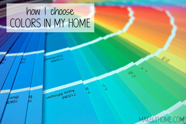
Although it my seem willy-nilly, my color selection is quite intensional. A lot of thought goes into the color palette for each room, which in turn makes color feel easy and natural. Today, I’m going to let you in on my secret formula, which works for paint, fabric or furniture selection.
…