When I went into Sherwin-Williams to buy paint to transform my son’s room, the sales guy asked me if I paint a lot. I started laughing, and I think my response was something along the lines of, “Um, yeah.” He entered my information in his system as a “professional,” so now I save a small percentage each time I buy paint there.
If you do as much painting as I do, it’s not hard to end up spending tons of money. Paint is really expensive when you get down to it. A quart of cheap paint runs you about $10; a gallon is around $20. The price skyrockets from there if you are buying higher quality paint. Then, after your projects are completed, you end up with tons of half empty paint cans stored in your garage.
 Recently, I’ve taken a smarter approach to paint buying. By shopping the “Oops” paint section at home improvement and paint stores, I’ve been able to buy some great colors for much cheaper prices. “Oops” paint is just paint that has been custom mixed at the store, but the customer decided not to purchase it for some reason – most likely the color didn’t come out quite like they wanted or they completely abandoned their paint can at the counter. Their loss is your gain!
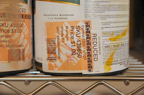
I check out the “Oops” paint section each time I go to Home Depot. Occasionally, I am able to pick up a quart of a very neutral color. However, most of the time I find myself purchasing a super cheap quart of bright yellow, turquoise blue, or pinky brown. I usually ask myself why someone would want that particular mixed, but who am I to judge when I get the quart for just $1 (or the gallon for $5)?
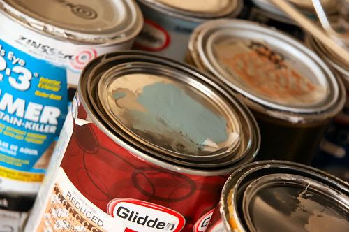
Why would I buy colors that aren’t exactly what I want to use? That’s because of color theory, my friend. You can do an Internet search for “color theory” if you are interested, but the gist of it is that you can mix some colors together to get other colors. Very scientific, huh? It’s just like when you learned in elementary school that yellow and blue make green.
For instance, I mixed four parts white paint with one part yellow and one part beige to create a creamy, antique white for a table (yes, the table), I’m working on. I loved that I spent a total of just a few dollars to create the perfect hue…and it’s a color no one else will ever have.
Don’t be afraid to mix leftover paint from other projects with “Oops” paint. You probably have some white just hanging around your garage that would love to jump into a brightly colored paint to create a lighter hue. You see? There is a use for all of that bright yellow and navy blue “Oops” paint you spy at the store.
Have you used “Oops” paint before? What have you painted with it?