There’s no surprise that I’m a huge fan of bold colors and graphic wall patterns. I love the impact that both elements bring to a room, and I combine the two whenever possible. However, the magic in a bold, graphic room is knowing where to play up the boldness and where to tone it down.
Last year when I first painted the grey and white chevrons in my bedroom, I admit that it felt like too much. It was really the only thing I had done in the room. I knew that there was much more coming, but I can see why friends and neighbors (and even some of you guys) couldn’t see through to my final vision. The graphic pattern hadn’t been toned down yet.
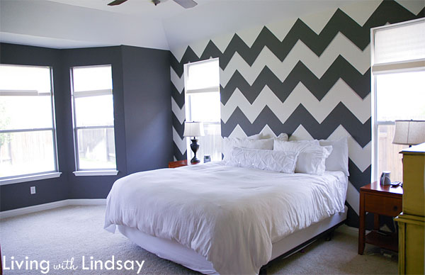
As I went through the process of accessorizing, the room gradually came into focus. Softening the hard lines of the pattern with fabric curtain panels certainly helped. A tall headboard and family photo gallery changed the look of the wall above the bed from the look in the previous photo to the look it has today.
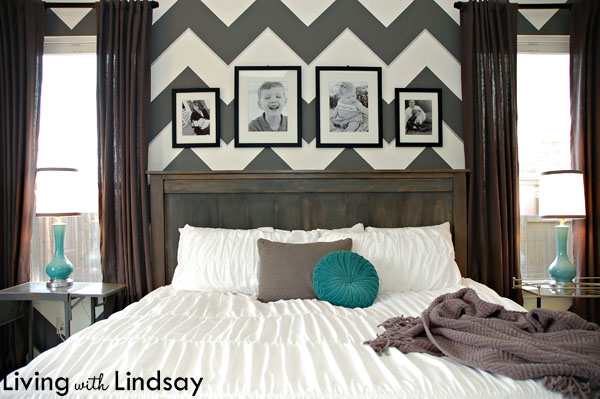
Letting the boldness of a room take a backseat isn’t a specialized talent. Instead, it’s just one of those learned skills that I’m positive anyone could pull off. The key is to treat graphic wall patterns and bold wall colors just like they are a regular, single colored wall. Accessorize them in the same way you would any other wall. Hang curtains to soften the lines. Use different textures throughout the room, so you don’t have an entire room of hard, sharp feeling surfaces.
Look at the impact that just hanging a curtain makes on a striped wall. Here is my ongoing playroom project (I’m so close to being finished!) before I hung the curtain rod.
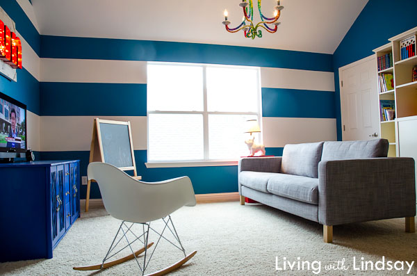
And here it is now, with the only difference being the curtain rod hung and a set of Ikea Ritva curtains flanking the window.
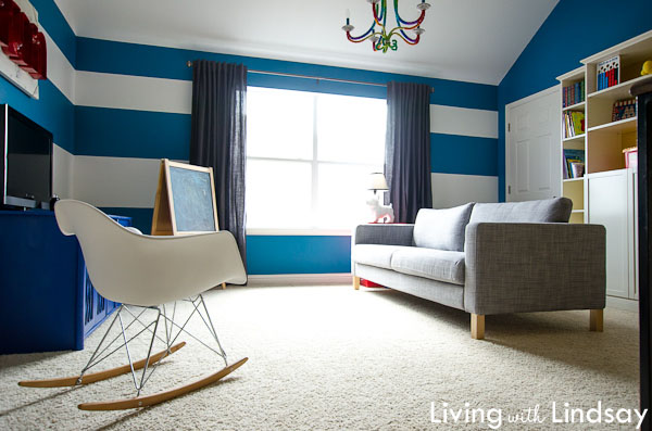
Just that little bit of neutral fabric does a lot to make the stripes in the room take on a less harsh vibe. It hides the end points of the stripes as they hit the window, so the room doesn’t look quite so broken up. In my opinion, this has the same effect as wearing a nude colored shoe, but instead of making your legs look longer, it makes the wall look wider.
I will eventually hang something on the walls on either side of the window in the playroom, too. That will further help the stripes to take a backseat to the rest of the room, like they did on this wall in my bedroom.
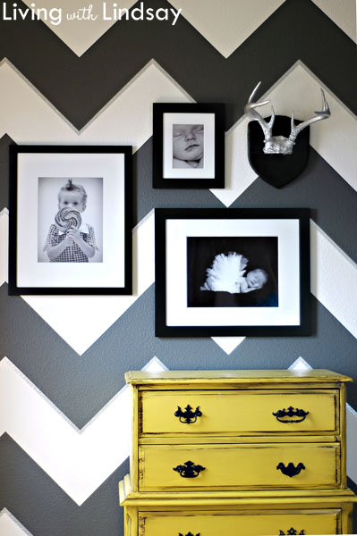
Bold colors and graphic patterns don’t have to completely overwhelm a room. Try to work them into a space so that they don’t become the room. It may feel scary before you get to the accessorizing point, but it does eventually all come together.
What’s your take on bold walls? Have you given much thought to accessorizing them so that set the mood without being the only thing you see in a room?