A blank wall is perhaps one of the most daunting challenges in decorating. Although there’s all sorts of things you could do there – hang a piece of art, add a piece of furniture, paint crazy stripes – it’s hard to make a decision when there are so many options.
My friend Kim had a similar problem in her eat-in kitchen. She has a blank wall next to the back door that is begging for attention. She’s a really great photographer (seriously) so she knew that she wanted to hang some of her images on the wall. But, even coming up with a plan for doing that felt overwhelming, so she hasn’t done anything yet.
Don’t we all know that feeling? I hear it over and over again. I’m even guilty of it myself!
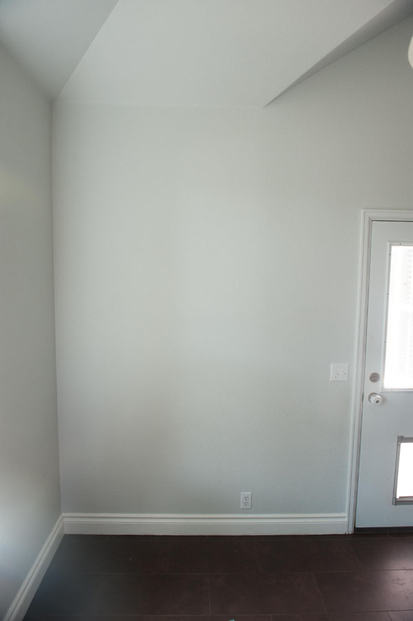
So, I asked Kim to send me the dimensions and take a quick photo of her wall so that I could help her come up with an idea for a gallery wall of some of her images. This is the image that she sent me:
I set to work recreating this wall in my photo editing software (Photoshop Elements, if you were wondering). I was careful to make sure that the digital image I created was scaled to be the same dimensions as her wall. Then, I came up with a layout that I liked for the space using different sized frames that were also appropriately scaled from their actual dimensions.
What I came up with was this gallery wall of mixed dimension frames:
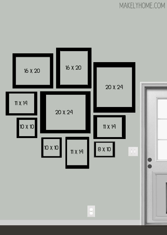
I think trying to achieve balanced asymmetry is one of the most difficult parts about creating a gallery wall. There are a few ways I like to keep it balanced. Firstly, I’ll make sure that there is a good mixture of light and dark images (or pieces of artwork, drawings, tchotchkes, or whatever you want to include). Those light and dark pieces either need to be evenly spread or balanced by size.
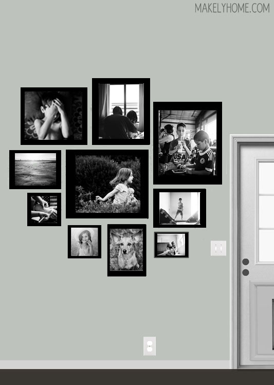
For example, in this layout I recommended to Kim that she put lighter images in the frames on the upper left and darker images on the bottom right. I did the opposite when I was plugging some random images into the frames, and I wasn’t happy with the result. Do you see how it looks top heavy with the darker images in the top left and the lighter images on the bottom right?
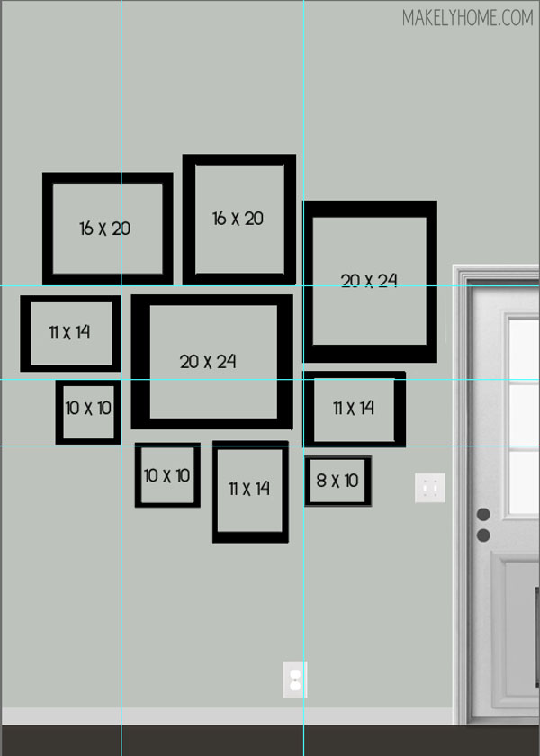
Secondly, I try to make sure that the spacing is even between the frames and that there are some vertical and horizontal lines throughout the gallery. These invisible lines help to make the asymmetrical layout look intentional. You don’t want every frame to line up, but you do want to have several groupings that do. I used guide lines in PSE to show you some of these lines in the gallery.
Now that I’ve created this little digital guide, it’s Kim’s turn to work her magic! We’ve talked about doing black non-matching frames with white mats and full color images, but I’m excited to see what she ultimately decides to do with her wall.
Do you have any blank walls staring at you in your home? What are you going to do to give them some life?
What a wonderful tutorial, Lindsay! Thanks for teaching me to think twice about simply hanging photographs randomly grouped together.
Bobbie
Thanks, Bobbie!
wow what a wonderful blog idea, this is some great information that I enjoyed seeing, That layout on those photos was simply amazing 🙂
Hi I’m trying to do a similar thing but what do you do when you have a round mirror and a round clock too? Also the photos we have are on landscape as well.