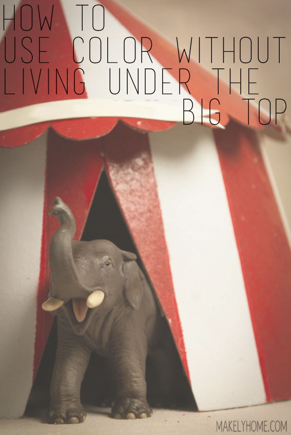
Earlier this year, I got an email from one of my sweet readers. She told me about her love/hate relationship with color. Sara said that she has a series of different colors throughout her house and she loves them all, but she was having a difficult time focusing on pulling it all together. As she put it, “How do I focus and not make it look like [I live in] a circus?”
I have been thinking about that question ever since then. Sara isn’t the first person who’s approached me with questions about using color effectively in a room, but she is the first one who phrased the question in that particular way…and I loved it.
So, as part of the blog hop series on “How to Decorate” that is being hosted by my friend Beth from Home Stories A to Z, I am finally sharing my thoughts on putting together a colorful homr that doesn’t look like it belongs under the Big Top. And welcome if you are joining me for the first time as part of this blog hop from Rhoda’s blog, Southern Hospitality. I’m glad you are here!
I use color in a lot of big ways around my home. My creativity thrives when I am surrounded by saturated hues, so I made it a point to bring that saturation into my home. You will find a lot of bold patterns and bright colors in every room. I always sort of feel like my color combinations and styling just sort of come to me. But, as I took some time to really consider Sara’s question to me, I realized that there were some key guidelines that I subconsciously follow when putting together a room.
Use One or Two Main Colors in Every Room
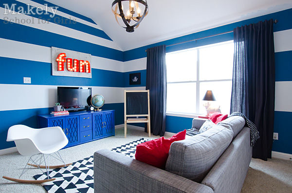
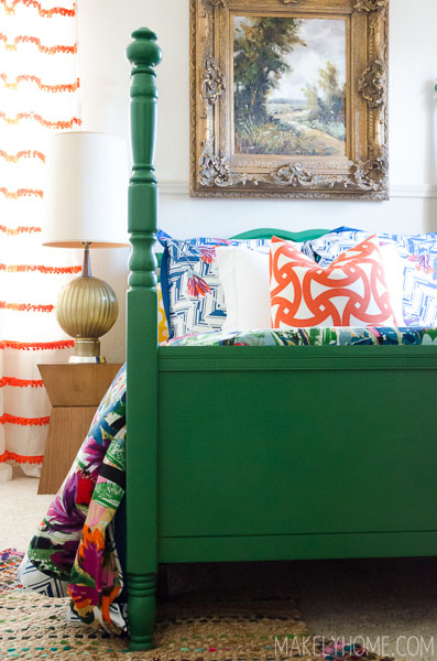
One of my friends chuckles every time she asks me, “What color are you going to use in that room?” The answer is always blue. I love all shades of blue, and I’ve picked it as the unifying color to use throughout my home. There isn’t a single room that I’ve tackled that doesn’t feature that color as at least part of its story. I have used shades ranging from turquoise to navy to royal blue.
The reason that I use so many variations of the same color is two-fold. First, the varying shades of a color keep my home from looking like it has a theme. Second, the colors coordinate but are different enough that each room has its own distinct personality. I want my home to be cohesive, but the rooms shouldn’t feel identical.
If you would like to use two main colors in every room, you can definitely do that! I’ve started adding in shades of green with my blues, and it looks gorgeous together. When selecting two main colors, just make sure that they are near each other on the color wheel. Picking opposite colors as your main ones might feel jarring if they are seen together in each room.
Ground Those Main Colors With Neutrals
Once you have the one or two main colors that you want to use throughout your home, you need to ground them with some neutrals.
Now, when I say neutrals, I don’t mean beige, unless the colors you are working with are only lightly saturated. If you are working with strong colors like I am, your neutrals should be equally as strong. The neutrals I use the most often are white and black (in their purest forms) and a dark, charcoal gray. If the room calls for it, I’ll use brown as well, but I always do a mixture of brown tones in a single room. I feel that mixture gives the room some texture and interest.
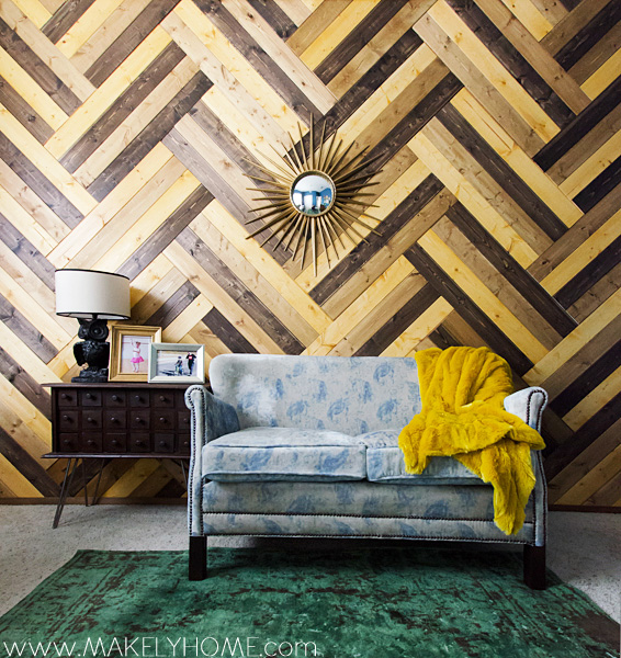
Don’t forget about your metallics, either! I use both silver and gold as neutrals and even combine them in the same room. Don’t feel like you have to pick one metallic accent and stick to it. Just like with browns, mixing your metal finishes gives your space a collected look.
Add Accent Colors that Coordinate With the Neutrals
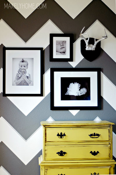
Now that you have a good base, it’s time to have fun with accent colors. This is where you are able to give each room some personality. My accent colors vary anywhere from yellow to red to orange.
You may notice that my accent colors are generally opposite of my main colors on the color wheel. I don’t set out to use color in this way, but adding in opposite colors as your accents helps them stand out.
I try not to have more than two accent colors in a room, and I actually stick with one when I feel like I can do so. Adding in too many accent colors makes it hard for the eye to find a resting spot – just like when there are three rings going on underneath the Big Top! As a decorator, it’s your job to help give the eye a place to land.
Rotate the Color Placement in Each Room
In order to keep your rooms fresh, you need to rotate the color placement in each room. In one room, put a bold color on the walls. In another room, but the bold color in your bed linens and put a neutral color on the walls. In another, bring color in with a few bold furniture choices.
Changing out the location of the color in a room keeps it from being predictable and following a strict formula.
Embrace Blank Spaces
Having an eye for editing is really important when you are using a lot of color in your home. Just like it’s important to bring in neutral colors to ground a colorful space, you also need to bring in some neutral surfaces. Allow a brightly colored wall to be free of artwork. Add just one great accessory or small grouping to a side table instead of a ton of tschotskes.
And remember, it’s okay to have a plain white wall – you have enough color everywhere else to support it.
Following these five guidelines, you’ll be able to embrace a home full of color without feeling like you live in a circus tent. Do you have any more that you think I should add?
It’s time to move to the next blog in the “How to Decorate” blog hop! Please go visit my friend Jen Rizzo and see what lesson she has to share with us today.

Really loved this post!!!
Awesome post! I love your colorful house 🙂 Cheers to no white walls!
Hi Lindsey,
Excellent tips you got here! I totally agree with you on using 2 main colors and adding neutral accents. I love the first room, great blue and white combination and great ideas for a little boy’s room.