One of my favorite new ways to draw color inspiration is to upload a gorgeous photo to the My Image Inspiration tool on the My Colortopia site. Some sort of computer magic pulls a sample color palette from that photo, and you have a great place to start designing your room.
But what if you don’t even have an image from which to draw information? What if you want to just see some color scheme ideas and see what moves you?
Enter Design Seeds, a beautiful website curated by designer and color forecaster Jessica Colaluca. Each day, Jessica fills Design Seeds with gorgeous color palettes selected from photos that inspire her. In return, we get to pour over beautiful color combinations that are relevant and foretasted as emerging color trends. In other words, these are the colors that are going to be “in” for fashion, graphic and interior design.
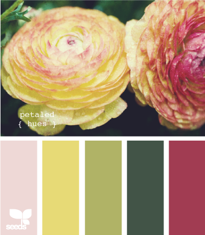
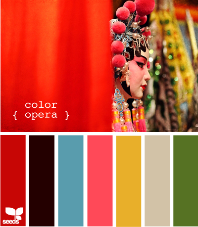
I was clued in to Design Seeds by Cindy of Blessed Design Studio, the great designer who was working on new graphics for my business card. She asked me to take a browse around the site and see if I found any palettes that I loved. The one I was immediately drawn to was Color Opera -it’s no secret that I like vivid hues.
So, how do you apply this inspiration to interior design projects? It’s easy to see how graphic artists could use these color schemes for their work, but it takes a little more digging on the site to find out a good way for we decor-obsessed people to use these color trends.
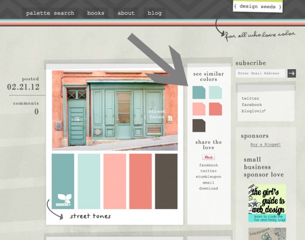
When browsing the site for color inspiration, you will see a section to the right of each palette that says “See Similar Colors.” You can click on any one of these colors to see every other palette Jessica has put together using that particular color. For example, if you’d love the darker teal in the below screen grab in your bedroom, you can select that color and see some other color scheme options using colors similar to that teal.
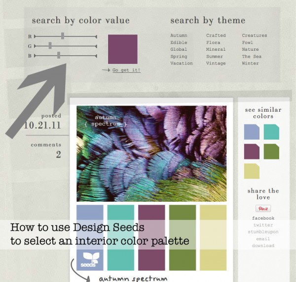
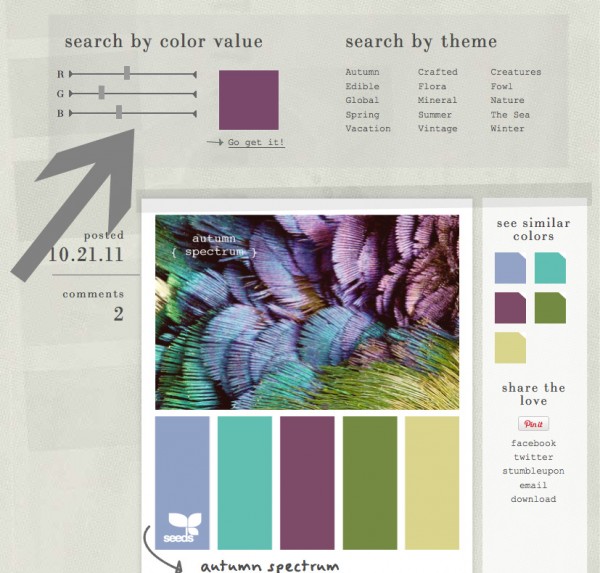
Have a color that you love and want to figure out what other colors would look great with it? You can use Design Seeds for that, too. Click on “palette search” at the top of the page and you will come to a color value slider. Move the Red, Green, and Blue sliders from side to side until you find your perfect color. Click “Go get it!” and color palettes using that or a similar color will be displayed.
I think having a personal color expert at our finger tips is going to be very rewarding when looking for a color palette for a room. There have been many times that I wanted a fresh perspective on color schemes using particular colors, and I am excited to have the opportunity to further explore the trends.
Have you been inspired by Design Seeds yet?
Boy is your timing perfect! Guess what we’re doing Saturday night before the movie :>
You know I am going to be blaming you for the loss of about 6 hours of my life tonight, right? lol – thanks for the link, I’m stuck in a particular room for my oldest son and now he and I can work together off of some of his favourite images 🙂 Cheers Chic!
I love Design Seeds! I have a whole pinterest board devoted to color palettes most of which are from DS.
Personally, I have been a bit frustrated with My Colortopia’s “My Image Inspiration” tool. It doesn’t seem to pull the focal colors that I see in the pictures that I upload. And then when I click to see a color palette they almost always have some pink or purple in them when none of my pics have those colors and neither of those colors are me at all! I’ve kinda given up on it. Or maybe I’m doing it wrong or something…
That’s really great feedback on the My Image Inspiration tool, Sandy. Thank you so much for sharing it! I’m going to pass it along to my contact there, as they are always looking for ways to make the user experience better.
Wow! Great find!! Such a cool website.
What a neat little tool! I’ve seen tons of those inspiration boards on Pinterest, but I didn’t know exactly how they were done… so many possibilities. Thanks for sharing it, my friend!