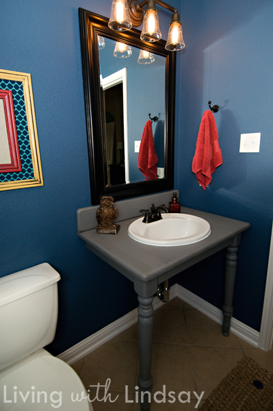
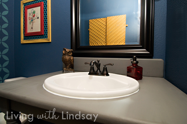
If you haven’t noticed, I have an unholy obsession with the color blue. I can’t even say it’s a universal obsession, as I don’t find it much in my clothing – the winner there is green. Instead, I just want to paint every room in my house blue.
I do know the exact beginning of this obsession, so I guess that’s a good thing. You see, Tom is red/green color blind. To him, red looks gray and green looks light gray. That leads to another discussion about “is the blue I see the same blue that you see,” but we’ll save that one for a different day. When we started planning a color scheme for this house, I was naturally drawn to green. But since Tom doesn’t interpret green the same way I do, he asked if green (in large quantities) could be avoided. I guess that blue creates almost the same feeling to me as green does, so we painted our first walls in the house blue (Smoked Turquoise by Glidden). And just about every other room has followed in it’s blue footsteps in some form or another.
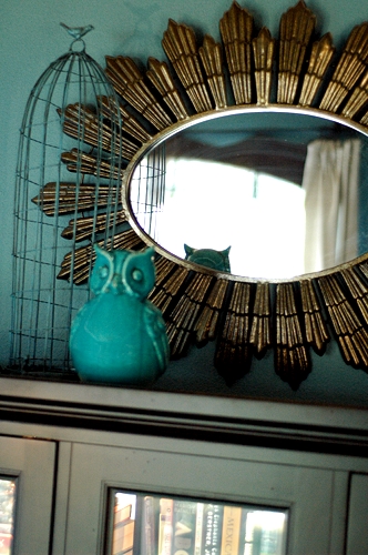
The thing I’ve learned over time about bringing one color throughout the house is that that color works best in varied hues. If I were to use Smoked Turquoise in every single room, my home would quickly look old and tired. Instead, I use a combination of light blues, dark blues, bright blues and muted blues. This gives my home the illusion of being pulled together without making every room feel the same.
This technique can be used with much success in single rooms, as well. There’s no need for all shades of the same hue to be identical. Layering tonal color creates a lot of dimension in your room.
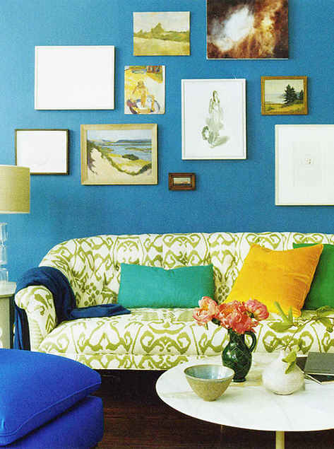 via Domino Magazine
When you think about color, don’t think about it in terms of the primary, secondary and tertiary colors that we learned about in junior high art class. Color, when used in combination, can have so much more depth and dimension than that. A medium blue wall, a navy throw and a cobalt ottoman can easily live in harmony with each other.
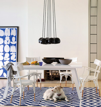 via Domino Magazine
If you want to keep your color palate much simpler, you can still offer a range of color tones. This white room is pulled together by the bright blue artwork and navy rug. If both were navy, the room would have a lot less depth.
Whatever main color you are drawn to, using layers of that color makes it easy to pull the theme throughout your entire home while still creating interest. Do you use tonal color in your home?

 via
via