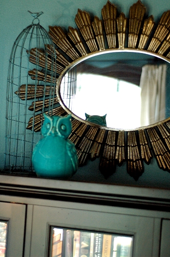
If you haven’t noticed, I have an unholy obsession with the color blue. I can’t even say it’s a universal obsession, as I don’t find it much in my clothing – the winner there is green. Instead, I just want to paint every room in my house blue.
I do know the exact beginning of this obsession, so I guess that’s a good thing. You see, Tom is red/green color blind. To him, red looks gray and green looks light gray. That leads to another discussion about “is the blue I see the same blue that you see,” but we’ll save that one for a different day. When we started planning a color scheme for this house, I was naturally drawn to green. But since Tom doesn’t interpret green the same way I do, he asked if green (in large quantities) could be avoided. I guess that blue creates almost the same feeling to me as green does, so we painted our first walls in the house blue (Smoked Turquoise by Glidden). And just about every other room has followed in it’s blue footsteps in some form or another.

The thing I’ve learned over time about bringing one color throughout the house is that that color works best in varied hues. If I were to use Smoked Turquoise in every single room, my home would quickly look old and tired. Instead, I use a combination of light blues, dark blues, bright blues and muted blues. This gives my home the illusion of being pulled together without making every room feel the same.
This technique can be used with much success in single rooms, as well. There’s no need for all shades of the same hue to be identical. Layering tonal color creates a lot of dimension in your room.
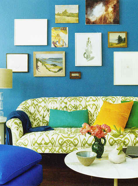
 via Domino Magazine
When you think about color, don’t think about it in terms of the primary, secondary and tertiary colors that we learned about in junior high art class. Color, when used in combination, can have so much more depth and dimension than that. A medium blue wall, a navy throw and a cobalt ottoman can easily live in harmony with each other.
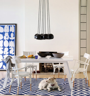
 via Domino Magazine
If you want to keep your color palate much simpler, you can still offer a range of color tones. This white room is pulled together by the bright blue artwork and navy rug. If both were navy, the room would have a lot less depth.
Whatever main color you are drawn to, using layers of that color makes it easy to pull the theme throughout your entire home while still creating interest. Do you use tonal color in your home?
Like your Tom, I am red-green colour blind. I also tend to lean towards tonal blues/ greys and yes, I even have greens in my home. Sticking to a watered down natural pallete makes sure I don’t do anything that ends up looking like I went to work in navy pants and purple socks (which has happened)! I rely on my hubs to make sure I am in the right tone a lot….he’s my colour guru 🙂
We have blue in almost every room of our house. It’s the color we agree on the most and after buying our house, we could only agree on one BLUE color. So hubby went away for something Marine Corps related and I painted the living/dining room combo a happy navy blue. From there we have grey kitchen with aqua accents, purple hued bedroom with smokey purple/grey dressers, and a front room with smokey blue and pale pale pale yellow stripped accent wall. It’s shades of blue with pops of other colors shining through. It’s our BLUE house without being depressing.
I’m glad I’m not the only one with the blue obsession. the only detour I’ve made from blue is grey! with the exception of my white and red kitchen. I have used different colors of blue, but yeah…everything seems to end up blue even though it’s not intentional.
I LOVE using blue to decorate my home! When we first moved in, I had blue for almost every room. Living/dining room was a pale blue, office was a vibrant Tiffany blue, master bedroom/bathroom was green/blue and brown. I’ve since changed some areas to bring in grey. I really feel like grey is very trendy in home decor (partly because it pairs well with SO many other things)! 🙂
EVERY SINGLE ROOM IN MY HOUSE IS BLUE!! Except my son’s room, which is yellow. Only because we haven’t gotten to it yet 🙂
I love blue, but have yet to paint the walls this shade (but my next project is the untouched guest/kids bathroom which will be Tiffany blue). I guess my obsession is with green. When we moved into our house I immediately painted the kitchen walls cactus green (you really have to see it to appreciate it) and then the living/dining which is one open space I painted “Partridge Grey” the most perfect shade of greige I have ever seen! Our bedroom (the entry is right next to the kitchen wall) is painted a muted sagey minty green with grey undertones. The office and kids rooms are painted the color of sand and of course, accented with green. I have some form of green in every room and it makes me smile. 🙂