As a blogger, I do a lot of work while I’m bleary eyed and guzzling coffee – trying to get some things finished before my kids wake up for the day. Most of those early morning hours are spent going through the previous day’s email. Many of those emails are questions and comments from you guys (Love those!), spam comments (Hate those!), and numerous product pitches from brands all over the world. Probably 90% of those pitches feel the wrath of my delete button. But, some of them have presented me with some really fun opportunities that I would never have received if I wasn’t a blogger.
Like the one I got a while back that said, “Would you like to interview HGTV star David Bromstad?” Since David has been my long time favorite on HGTV, I jumped at the chance. I have followed his HGTV career since he won the original Design Star competition back in 2006 and then went on to have his own show, Color Splash. David has a fabulous sense of color and he is a former Disney illustrator…and we know how I dig Disney illustrators for their unique take on shape, color and whimsy.
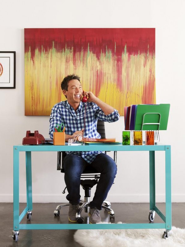
David has designed two new limited edition bottles of Coffee-mate creamer that are only available at Target, and he is promoting a Get Inspired With Coffee-mate Sweepstakes that’s going on now (more about that below). I was so looking forward to talking him about how the differences in product packaging design versus room design. Just pretend that it’s me on the other end of his phone.
See? He loves me! I knew we would be BFFs if we ever had the chance to chat.
But then, I found out that my chance to talk to David would come smack dab in the middle of my phone/Internet free vacation, and I was so disappointed! On a whim, I asked if I could send him a list of questions through email, and the PR company said that he would be happy to answer them for me. SCORE! So, I thought long and hard about some things I wanted him to answer and submitted some questions. Here is a transcript of the recording of our “virtual” chat:
LINDSAY:
Do you use the same design process when you are working on products or product packaging as you do when you are designing a room?
DAVID:
Well, when you design a room, you want to make sure that you are starting with your most expensive piece of furniture. A lot of people start with paint, and I think that’s completely the wrong way to go, because paint is the easiest thing to change…there’s so many different colors of paint, there’s thousands of different colors of paint. When you are buying a $3,000 couch or even a $1,200 couch you want to make sure that you are investing the money there, because you can color match any color these days. So, I always start with my most expensive pieces, like your couch, your rug, your side chairs, any sort of hard goods, draperies are very expensive, and then whatever you find, whatever you can afford, whatever looks great together, then you can match your paint after that.
Now, designing something for packaging is much different, because in interior design you can put in so many different aspects and elements – like really simple things or really complex things. But when you are designing for packaging, everything has to be in one little, tiny package, and it’s got to tell as story. At the same time, it has to have branding, so there’s lots of limitations to it. But, I’ve found that by doing packaging design, I respect the package designers so much more now than I ever have, because it is very difficult. But, it was so much fun to do.
The one thing in interior design and packaging, or designing shoes or whatever, I always design for the client and they are always my inspiration. So, that’s the one thing they do have in common.
LINDSAY:
Do you have a go-to color palette to share with someone who is just trying to bring some non-neutral colors into their spaces?
DAVID:
Well, if people are just dipping their toes into color, I say dip it slowly. You don’t have to go crazy. A lot of people think that painting your walls a crazy color is a great way to be introduced to color, and I think that’s completely scary. You are going to be completely surrounded by this color. That’s why people get afraid of color – they’ll paint their room color and then realize that they hate it before they even put their furniture into it. What I say is to keep everything neutral and then bring in bold pops of color through pillows, accessories, artwork, and then see where you’re at and kind of maneuver from there. Then, maybe go to a colored chair.
But, I always say, keep your couch neutral – that’s one thing that I always like to do. But if you can afford a very expensive colorful couch and you know that you’re probably going to want to exchange it in the next five years, then go for that, too. It’s all about bravery.
LINDSAY:
What advice do you have for someone who loves color but is scared that their home will look like a circus if they use too much color?
DAVID:
(Laughs) I am a proponent for painting people’s walls tons of different colors, if they so choose. If you are going to do that, then you have to keep all of your furniture very neutral – and when I say neutral, I mean creams and beiges. That way, it complements each other. If you have colorful furniture with colorful walls, it’s going to look like a circus. But, you can have circus colored walls, so that’s fantastic. I’ve done it before and it worked out great, but everything I brought in was either white, black, beige or gray and then maybe a colorful pillow here or there, but you don’t want to overwhelm it. You want to make sure that your color is in one place – either on your walls or in your accessories.
LINDSAY:
And here are two questions that I chose from reader submissions. They were so excited to hear that I’d have the chance to ask you a few things:
Where do you find inspiration for your custom artwork? Are you a professionally trained artist, or are you self-taught?
DAVID:
The inspriation comes, again, from my clients. I am very inspired by what they love, what’s meaningful for them. I try to do a little snooping when they aren’t in the house to try to see what kind of things are precious to them. And I have a conversation – just sort of casual and not letting them know what I’m doing – but looking for something meaningful to them. I also have to look at the room. The artwork is the very last thing I do for the room, because I want to see how everything is pulled together. If it needs something serious because it’s too whimsical already, I try to do something abstract or something to pull all the colors together and not have it overwhelm the room. But if the room is looking a little tame and it needs a little humor, then I’ll paint something funny. I always like to bring a sense of humor, whether it’s through the artwork or the furniture, but it has to be cohesive.
I am a professionally trained artist. I went to art school. But, I was a heck of a painter before I got there, so I definitely taught myself and took as many art classes as I could in high school. And then, I went to Ringling School of Art and Design and got a BFA in illustration.
LINDSAY:
What do you do about coffee table placement in front of a reclining sofa? If the footrest comes up, it seems like the coffee table is too far away.
DAVID:
A reclining sofa sounds fantastic, it sounds a little La-Z-Boy like. (Laughs) If you are going to do a coffee table in front of a reclining sofa, the coffee table has to be easy to move. And, if it just isn’t going to work, what I like to do is do garden stools or small little chunks or pieces of wood that you can float to the sides so that if you are reclining, you can put your glass down there. Maybe do a cluster so that it can be moved around very easily.
I think David offers some really great advice for introducing yourself to a little more color in the home. I’m thrilled that he took a few minutes to share his thoughts with us.
As I mentioned, David and Coffee-mate are sharing a Get Inspired with Coffee-mate Sweepstakes in conjunction with this new launch. Fans can share a picture of their favorite coffee moment on Twitter, Facebook and/or Instagram using the hashtag #CMInspiresSweepsEntry and be entered to win one of these prizes:
One (1) Grand Prize:
- Signed David Bromstad Giclée , a museum quality reproduction of one of his paintings
- $500 Target® GiftCard
- Free COFFEE-MATE® creamer for a year
Four (4) Weekly Prizes (one prize per week):
- One (1) COFFEE-MATE® gift pack which contains Coffee-mate creamer for a year
- $500 Target® GiftCard
To learn more, visit Coffee-mate on Facebook or join the conversation with #CMInspires.


Lindsay!!!! You asked him my question about his cutom art!!! I. AM. DYING.
I knew you would love that!!
Obviously he hasn’t been following your blog to know that you can have great paint and colorful furniture!!!! I think you need to call his PR people and try for some phone time or get that boy to Texas!!!
I know! LOL! I was totally thinking the same thing. 🙂
Lindsay, I love that you found a way to make this work and have your vacation. I would probably have canceled my vacation to talk to David. No joke he is on my short list of dream people I want to interview! He has such great tips and his sense of humor comes across even in writing…love him!
Great interview, Lindsay. Very thoughtful questions and very thorough answers.