Happy Thanksgiving to all of my American friends! I hope that you are able to spend your day with friends and family and bask in the warm glow of laughter.
But, after you have eaten all of the leftovers you can stand, lost a football game (sorry Texas A&M; fans!), and listened to the cousins argue about whose turn with the Wii it is, you may be ready to think about something more fun. If you are anything like me, that fun thing to think about will be your home.
I’m in the beginning stages of re-painting our powder bath. It’s a forgotten room, although one frequently visited by guests. And it’s just bor-ing. I’m embarassed to even show you how boring it is. But, I’ll do it, because I apparently have no shame.
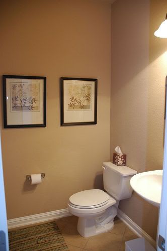
Yikes.
Are you thinking of repainting a room in your house right now? Do you want to show your Mom the color you are thinking of for your bedroom walls? Want your Aunt’s opinion on that new color you are considering for your son’s room? Well, this is a great time to do it, folks.
If you are ready to try out some paint colors but not ready to actually pull the trigger on painting the room, I have a great way to show you how to hide test paint.
Now you see them…
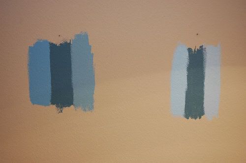
Now you don’t…

When I’m painting test colors, I like to hide them behind pictures hung on walls or pieces of furniture. There’s no reason to live with test stripes on your walls if you can figure out a great way to hide them! In a room where you have a variety of lighting throughout the day, make sure you test your colors in enough areas to get a sense of what the paint will look like as the light changes.
Incidentally, I received my Farrow and Ball colour card (with THE Tori Spelling ‘Parma Gray’ paint chip) in the mail this week. I almost immediately rushed out to Home Depot to pick up a color match test sample of paint. As much as I know (or really, assume) that the F&B; paint is far superior in color depth and quality, I couldn’t pay $125 for a gallon of paint unless it was made with 24-karat gold. And maybe not even then.
My paint guru at Home Depot reminded me that the color match wouldn’t be absolutely, 100% perfect due to the base shade and pigment content, but since I was buying a $2.97 jar of test paint, that didn’t really matter to me. I slapped the test paint on my bedroom wall (behind my framed bridal portrait, if you most know), and it seems like a pretty dang good match to me! It may be slightly more blue than the Parma Gray chip, but the chip looks slightly more gray in person than it does to me on my computer screen.
Several of you had asked me to pass along the Home Depot formula if I was able to get a good match. For those of you, here it is:
BEHR
Base: Premium Plus Ultra Pure White (PP100)
Type: Interior
Sheen: Flat, Matte
Colorant for 8oz:
- B- Oz (0) 384th (30)
- D- Oz (0) 384th (7)
- E- Oz (0) 384th (4)