Choosing a color scheme for a new decorating project is one of my favorite parts about being a home decor fanatic. Your choices really set the tone for how the finished room will feel, so I think it’s incredibly important for you to love the colors you decide to use. It’s a very personal choice.
As you can imagine, I get a lot of questions and emails asking for my help in selecting colors. It’s a lot of fun to search through my fan decks and put together color scheme suggestions. A lot of times, my choices are inspired by a “feeling” – the colors just feel right together. Other times, I draw inspiration from textiles that I think are beautiful. Regardless, it’s important to me that those colors say something about me or about you (if I’m helping you select a color scheme).
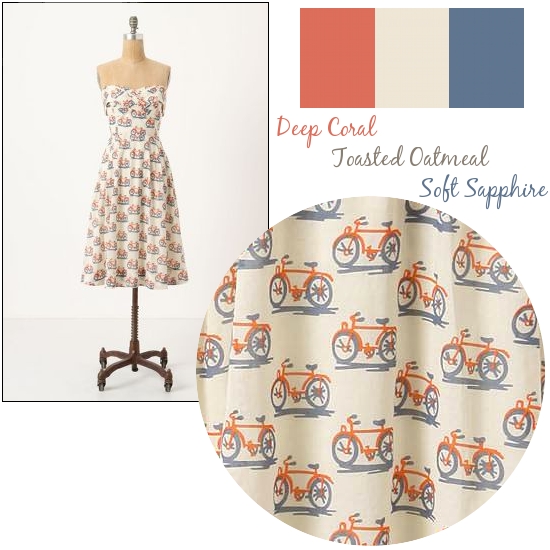
For example, the below Bike Lane Dress from Anthropologie invokes a light and carefree feeling. You can see that I have chosen a color scheme (the colors are from the Glidden color palette) based upon the dress. If this was to be a room in my house, I’d use either the Toasted Oatmeal or Soft Sapphire (if my room had a lot of natural light) on the walls, and bring the other colors in through accessories. I might even steel Mandi’s coral dresser.

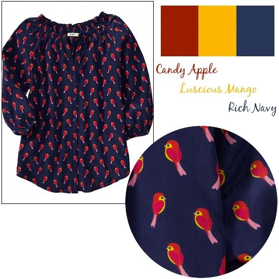
If you’d like to go a bit bolder, find some bolder inspiration. I own (and covet) this bird print top from Old Navy, and it was only after I bought it that I realized it is largely in the same colors as the powder bath that I’m working on. I’m sure you are thinking, “Oh, Lindsay. That is crazy.” But, I’m promising that it works and it works really well. As you have seen, I have navy on the walls and am bringing the yellow and red in as accents. I’m hoping to have the entire room finished in the next week or so, but you know how slow I am when I’m making design choices!

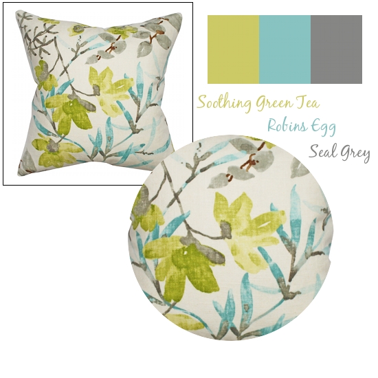
Traditional home decor textiles are, of course, a great place to draw inspiration, too. A pillow, rug or curtain panel is a great place to start. This Gazebo Cloud pillow from Tonic Living has a fresh palette. If you wanted to put color on your walls based on this pillow, I’d suggest going a shade or two lighter than the Robins Egg or Seal Grey. Or, you could do a neutral wall (maybe something like Glidden’s Oyster Shell) and bring in the colors through accessories and the one boldly painted piece that I think every room should have.
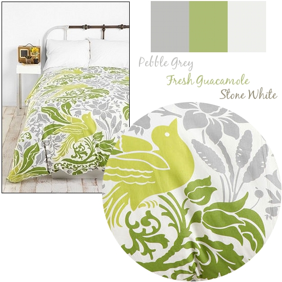
 A fun duvet cover is perfect for pulling a new color scheme, and this Flourish Bird Duvet Cover from Urban Outfitters is no exception. It’s also a great example of how colors can be inspired by a textile but not match them exactly. As long as the shades you choose don’t clash with the textile or with each other, your blended color scheme will work perfectly.

As I’ve said, color choices are extremely personal. They need to be based on YOU, not what you see in magazines or read about in blog posts. They should fit your lifestyle, your home, your feeling about the you that you are. You will likely notice that you select your clothes based upon those guidelines, and I have a feeling that your home textile selection would be no different.
MyColortopia, the other blog that I write for, has put together a little quiz that you can take to help you choose color schemes that fit your personality. If you are reading in email or via a reader, you may have to click over to my actual blog to take the quiz. It was pretty accurate for me, and it even suggested some colors in shades of purple and orange that I hadn’t considered but really liked.
How do you choose color schemes for your home? What did the MyColortopia quiz say about you?
I have partnered with Glidden/ Akzo Nobel Paints to participate in the My Colortopia program but the thoughts and opinions expressed are my own.
I love those two green combos! I’ve taken that quiz before and it was very accurate for me — came back with orange, which is my favorite color and the main accent in my living room and one of the accent colors in my master bedroom! Thanks for the inspiration!
Ha – Gazebo Cloud Pillow is pretty much my living room color scheme except for the grey. I have soft white instead. Fun!
I got that Old Navy shirt in the cream, and totally plan to return for the blue one! Great post.