Paint color can be such a finicky thing.
When Tom and I first got married, we lived in a white walled apartment that had a beautiful view and a funky smell. It was decorated in our mismatched decor – his: black leather, glass and chrome; mine: overstuffed, khaki and covered in cat pee if we are being honest. We didn’t really care what the apartment looked like because we were in LURVE, but when we bought our first home we wanted to really make it ours.
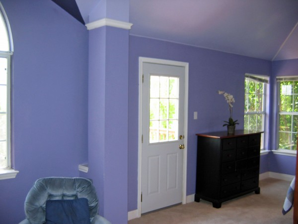
We closed on that first house about a month before we had to move out of the apartment. We thought it would give us plenty of time, working nights and weekends, to rid it of the previous owners’ touches. There was the powder room that had an apple orchard scene painted on one wall, complete with molding to look like a window and half a bushel basket screwed to the wall. There was the master bedroom that was painted in three shades of purple.
 Can you see the three shades? One on the walls, one on the angled part of the ceiling and one up above the arched window. This is the previous owners’ furniture, in case you were wondering.
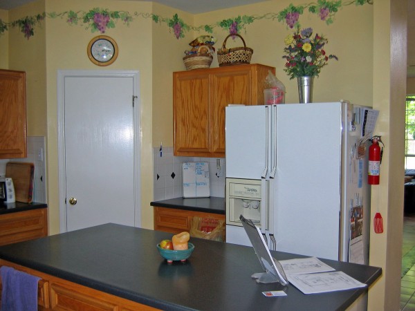
Then, there was the kitchen. It was painted in a muted, nondescript yellow (not an awesome yellow, y’all) and butted up next to the dark family room that was painted maroon. I don’t remember if my favorite part of that kitchen was the countertop that overhung that island so much that you couldn’t completely open the refrigerator door or maybe the awful fluorescent light fixture.
Oh, no wait. I do remember. My favorite part was the purple grapes stenciled all around the border of the room. Hello 1992!

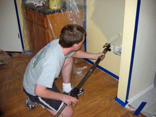
The day we closed we got busy ridding that kitchen of it’s vineyard. This was long before either of us knew anything about paint, and we just started rolling paint on the dingy walls without primer or cleaning them. The sweet mint color I had so carefully selected? Well, it was going on hospital green.
With only a few rolls under our belt, Tom said, “This is awful.” I replied, “Oh, you’re color blind. It’s nice! I think the grapes are distracting you.”

We rolled and rolled and it wasn’t getting any better. I finally had to admit that he was right (and it pains me to admit that!), and we went back to the home improvement store for more paint. This time Tom picked the color, which ended up being a very boring beige. Believe me when I say that the “boring” aspect of that color fit the style of my decor at the time.
Fast forward almost ten years later, and lots of things have changed. I’m working my rear off to rid our new home of its neutral, non-offensive beige walls. You can buy paint testers at most paint stores, so you never have to live in fear of your mint green turning out hospital green after you bought several gallons of it. And since everything – and I mean EVERYTHING – has a digital component, you can virtually paint your walls without having to leave the comfort of your sofa.
A new tool has been released on Glidden’s My Colortopia site (of which I am a team member) that allows you to upload your own photo and try out different recommended paint combinations in your very own room. I helped to pick a few of the suggested combinations, and there’s not a beige wall in sight. If you really don’t want to leave your own sofa, you can use preloaded pictures to see how a particular paint color works overall in a room.
Where was this tool back when I was painting with hospital green? It definitely could have saved me from having to admit that Tom was right.
I have been sponsored by Glidden® brand paint to write this post but the thoughts and opinions expressed are my own.
Awesome! I just bookmarked My Colortopia! Thanks for the info!
You’ll like that site, Belinda! I love reading the articles from the other bloggers – they are all so talented and great when talking about paint colors and techniques.
Ha!
It’s great to read the ‘back-in-the-day’ stories and to hear about real life decorating mishaps. Even though I’m a designer, I get caught up in the perfect houses seen online.
It takes time to put together, and decorate a home. Thanks for your story.
Ha! Thanks, Kiki! It’s funny to see how far styles can swing in a decade or two. I bet (or hope) the previous homeowner wouldn’t be digging her grapes anymore either.
Call me crazy but I love the purple with white trim. Each their own though. Definitely agree on the hideous yellow kitchen with grapes.